Kaiser Permanente Building
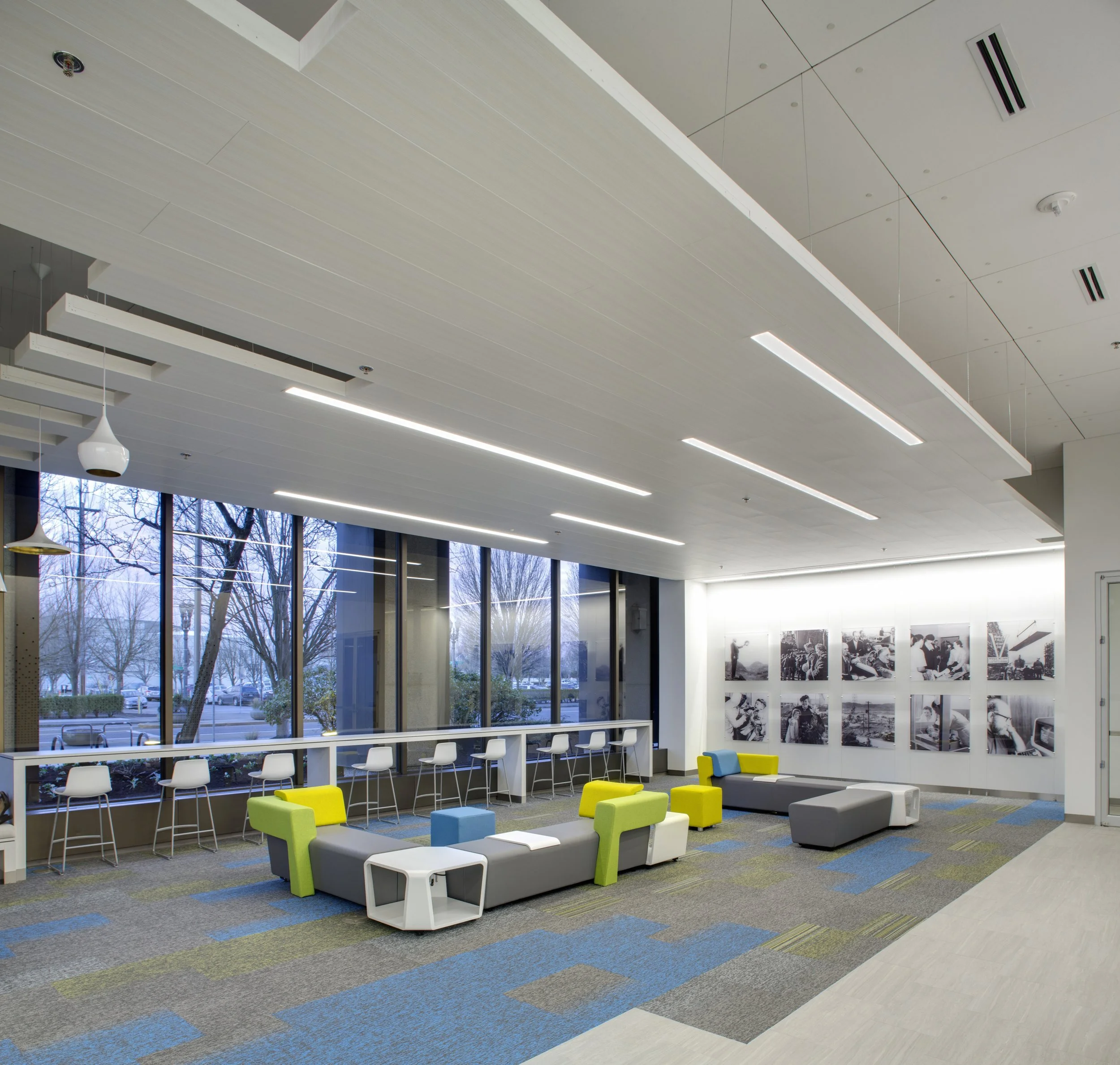
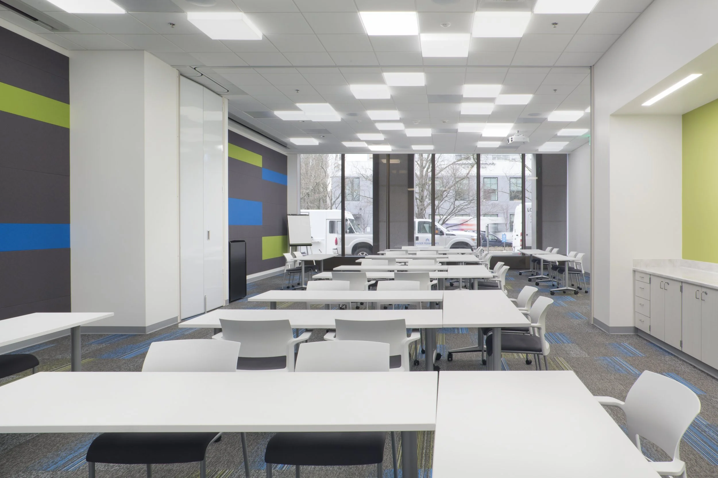
The lobby of this seventeen-story city tower was transformed to promote wellness and encourage visitors and employees alike to relax.

The concept of design for the KPB remodel was developed by juxtaposing a map of the city of Portland with the building floor plan, resulting in a clear sense of place defined by landmarks, district influence, signage, art, and color. Connecting Portland’s community and the NW region, the design takes cues from Portland’s well-known “five quadrants” and the concept of the “City Within”.

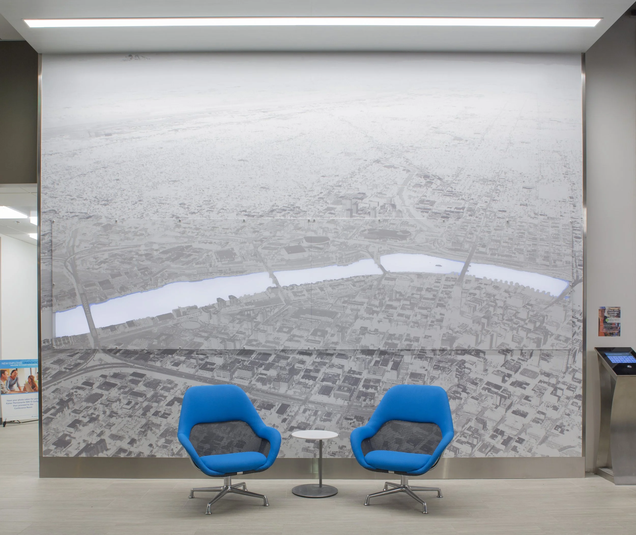
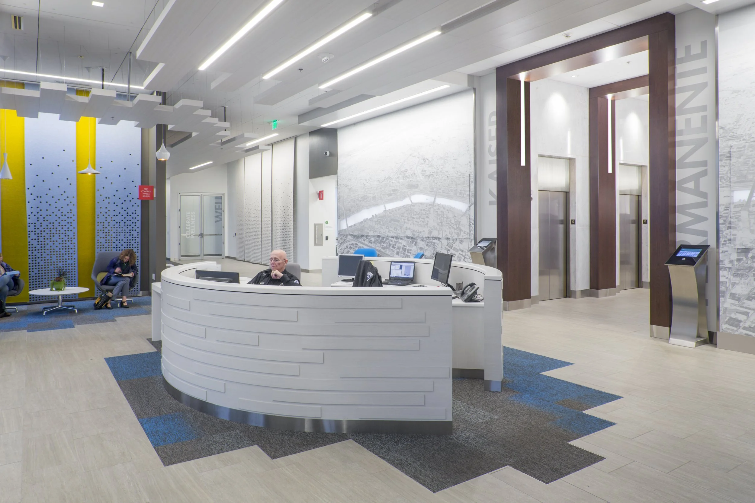
What was once a dated and confined space is now an open concept environment with a welcoming information and security desk centered between the main entrance and elevator core. The circular desk, organic in nature, has two beautiful aerial photographs of the city as a back drop, the Willamette River backlit, a focal point of the space.
LOCATION
Portland, OR
SQUARE FEET
5,000
COMPLETION DATE
2015
CLIENT
Kaiser Permanente


